


branding and social media strategy
Agi Collective
Agi Collective is the name of my freelance design business and Etsy Shop. Inspired by my childhood nickname “Agi”, Agi Collective is the summation of all my design work, in and out of the classroom.
The Task
Agi Collective needed a logo and brand guide that reflected my design work and personality. My goal was to create branding that was feminine, playful, and had meaning. Additionally, I wanted to incorporate the color pink and have a great emphasis on typography rather than imagery or illustration.
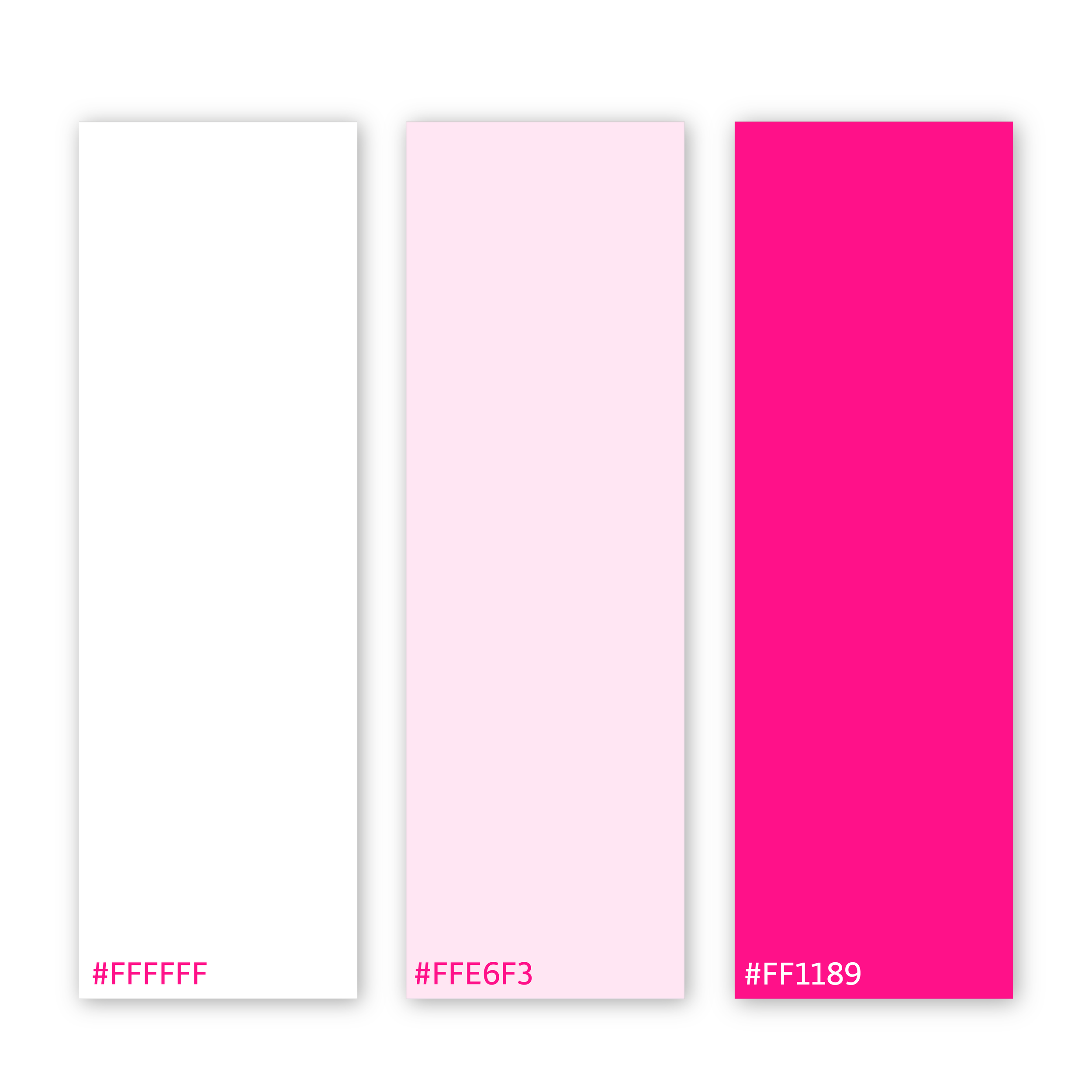
Color
Agi Collective’s monochromatic pink palette is playful, yet feminine. The bright pink is bold and dyanamic while the pastel pink is elegant and relaxed. This showcases my goal as a designer to provide designs that can go outside of the box while maintaining a sleek and professional attitude. White adds a great amount of contrast and can be used for text or background colors.
Type
Cochin Regular is a classy serif font that can be used for titles and bodies of text alike. It is formal, elevated and classy, adding professionalism to Agi Collctive’s logo design. Chantal Bold is a handwritten font that is primarily used for titles and subtitles. This font is dynamic, playful, and energetic, bringing a youthful energy to Agi Collective’s branding.

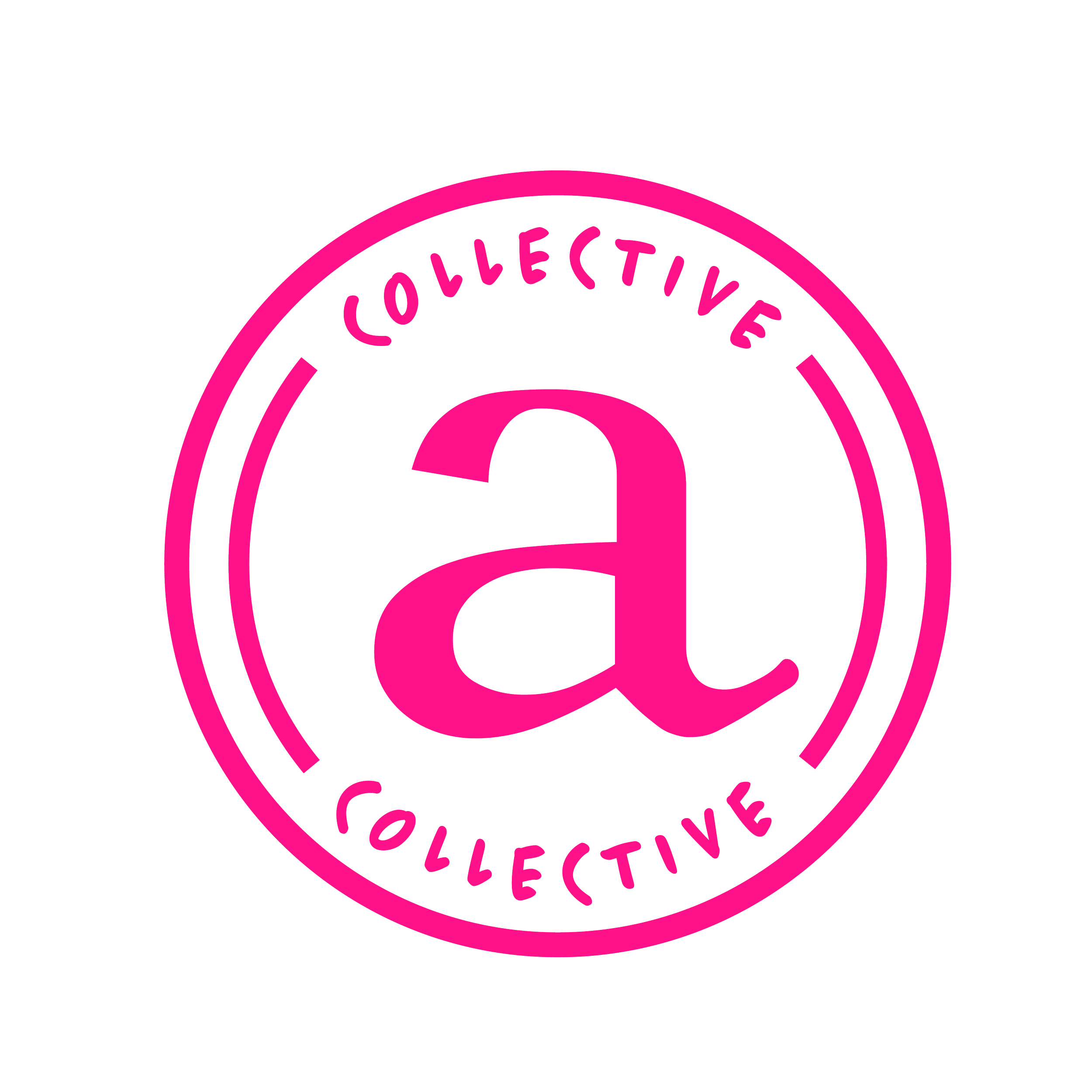
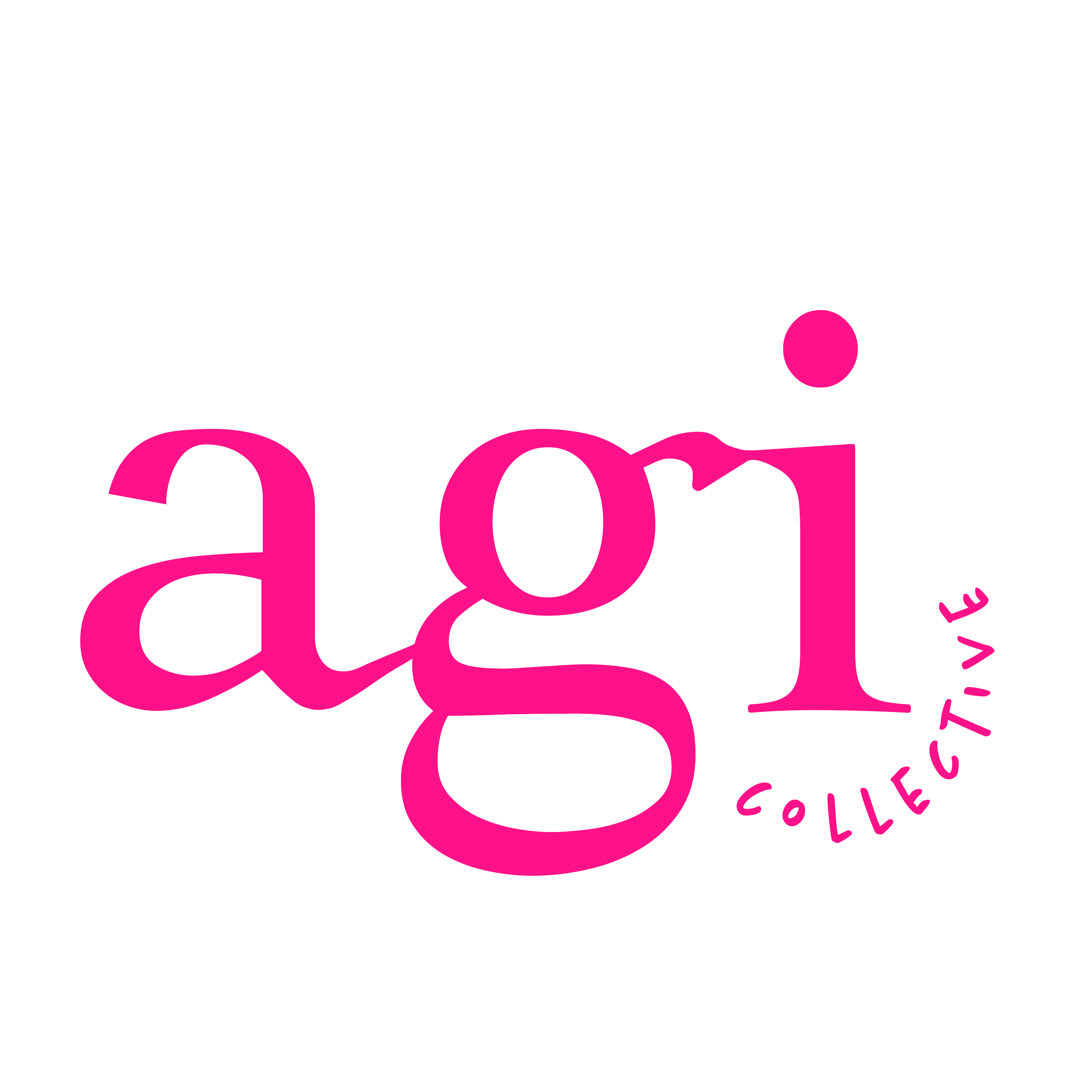
Logos
The final logo design is sophisticated with a touch of playfulness. The alternative logo is a variation of the initial logo, while the submarks incorporate the idea of stamps as a way to identify a location. These stamps identify Agi Collective as my own design work and showcase my identity as a designer. My logo designs all display the playful, elegant and feminine aesthetic that I wanted Agi Collective to achieve.
PRIMARY LOGO


Branding Guide
