

rebranding design
Jade Leaf Matcha

This Personal project was inspired by two of my favorite pastimes: drinking matcha and brand design. Jade Leaf Matcha, my personal favorite matcha brand, sells a variety of matcha specialties as well as tools for creating matcha masterpieces.
Jade Leaf Matcha currently has a medicinal style packaging. How can I make the packaging more modern, natural, and organic?
The Task

Jade Leaf specializes in matcha, a Japanese green tea. To emphasize the main product being matcha, I decided to go for a monochromatic green color scheme. This unique and eye catching packaging draws the attention of customers in grocery store shelves and social media posts.
Color
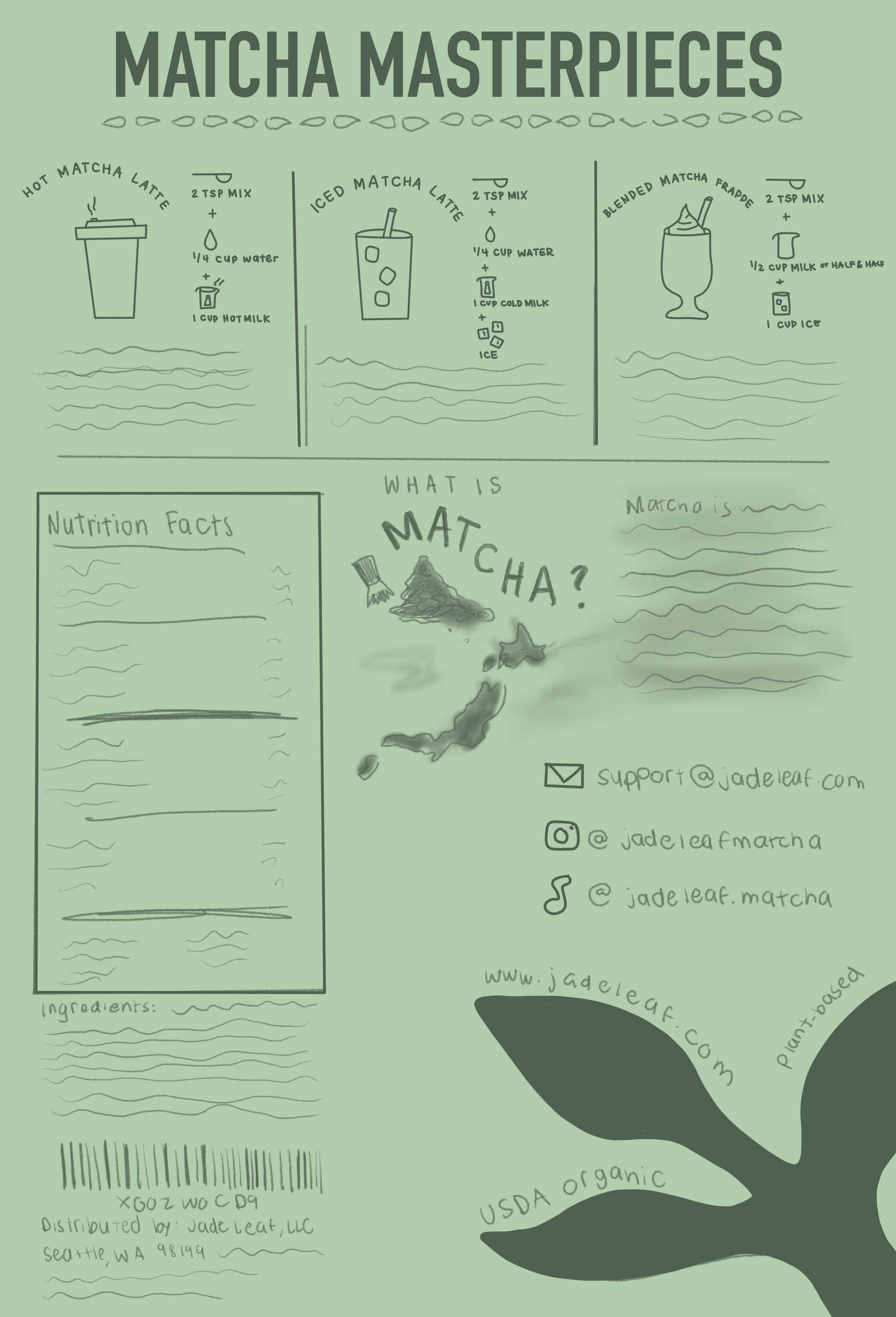

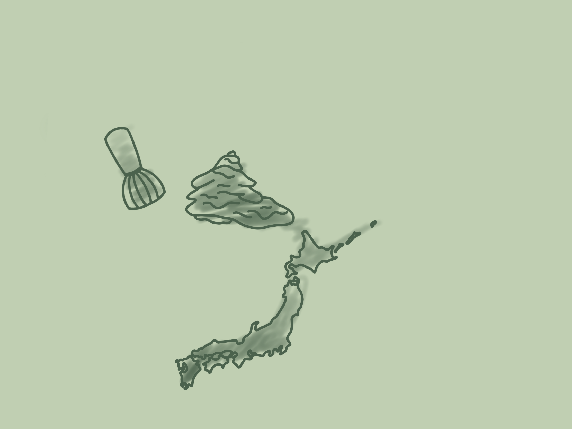
Sketches
Using Procreate, I sketched the layout of how I wanted the packaging design to appear. I made great layout changes utilizing the rule of thirds and began to explore my ideas for illustrations.
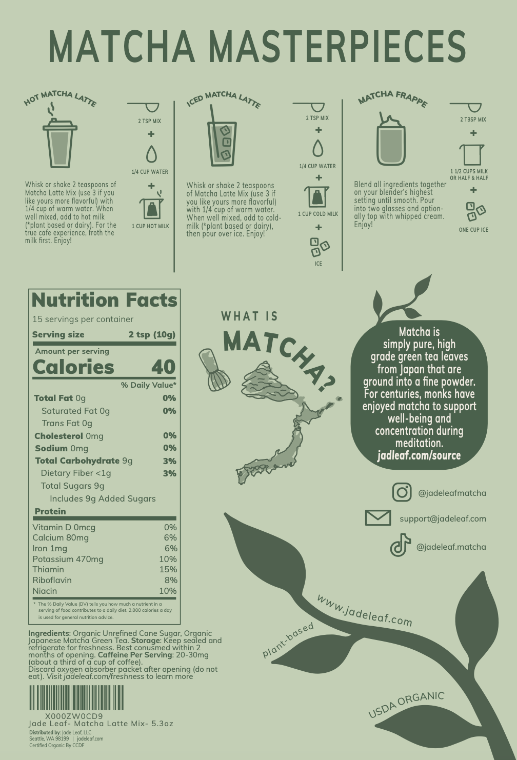
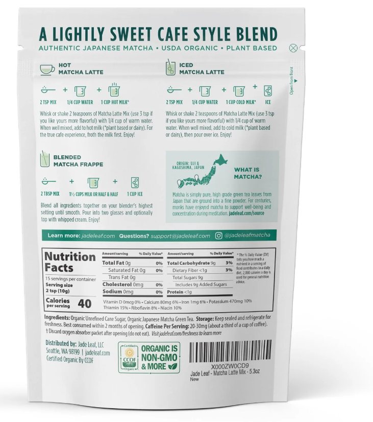
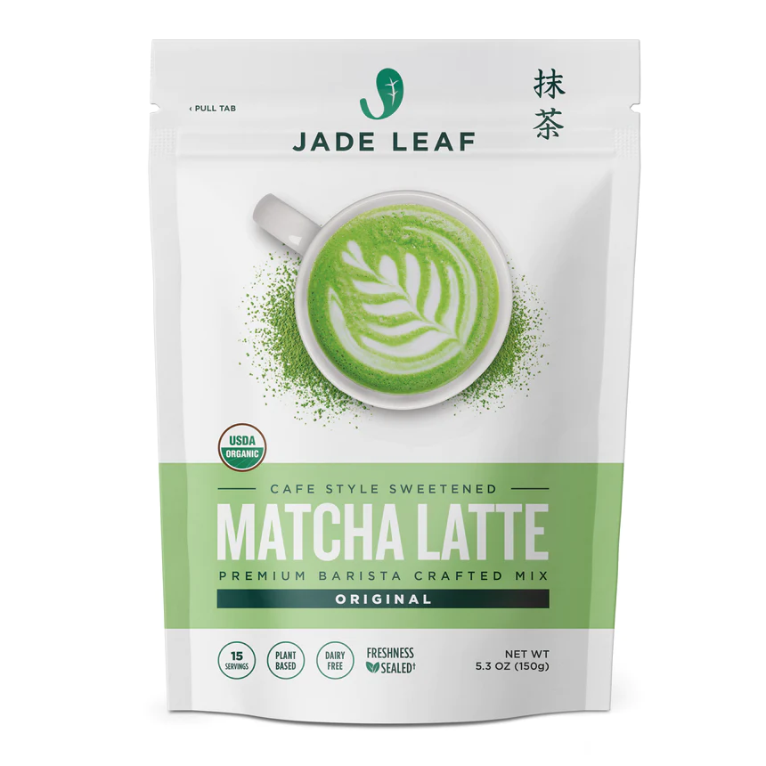
The packaging design is organic, modern, and serene. This emphasizes the calm, steady eneergy obtain from naturally-made matcha. Additionally, this design incorporates Japanese letters and the story behind traditional Japanese matcha. The packaging redesign replaces a medicinal appearing product with an organic, traditional Japanese matcha.
Final Design

Front of Packaging

Back of Packaging